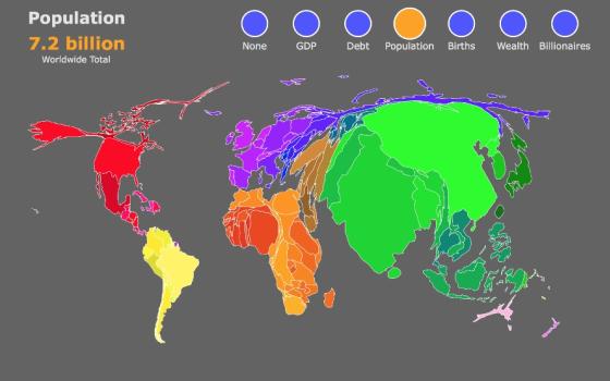
One of the coolest interactive maps created so far this year can be found over at Metrocosm. Using data from a few different sources, it explores different socioeconomic factors on a country-by-country basis, using size to grow or shrink a country based on factors such as population, amount of debt, and number of billionaires. It’s a fascinating way to get a picture for which countries are the "biggest," when it comes to factors other than the geographic space they take up.
This week’s 3 Stats are taken from the same research.
[Georgia Perry is a freelance writer based in Oakland, California. She's contributed to several print and online magazines including, The Atlantic, CityLab, Portland Monthly Magazine and the Portland Mercury. She was formerly a staff writer at the Santa Cruz Weekly in California. Follow her on Twitter @georguhperry.]


